CASE STUDY
Anthony Dawson Real Estate (UK)
Anthony Dawson Real Estate is an independent UK property business operating across residential sales, lettings and commercial property.
The brand already had an established identity, but its marketing lacked consistency across platforms and customer touchpoints. My role was to refine the visual identity and develop a cohesive marketing system that could be applied across social media, digital campaigns, property marketing and print.
CONTENT STRATEGY | SOCIAL MEDIA | GRAPHIC DESIGN | META ADVERTISING | PRINTED MATERIALS
BRAND REFINEMENT
Turning an existing identity into a consistent brand system
I developed a practical brand guide covering logo variations, typography, colour palette and supporting visual treatments, creating a clear and consistent foundation for all marketing materials.
VISUALS
This is where I would show the brand guide large and clean, rather than displaying dozens of logos.
Underneath it, perhaps three small examples:
Email signature | Business stationery | Business card
The international business card is particularly useful because it shows how the identity translates into a much more detailed piece of collateral while remaining recognisable.
PROPERTY MARKETING
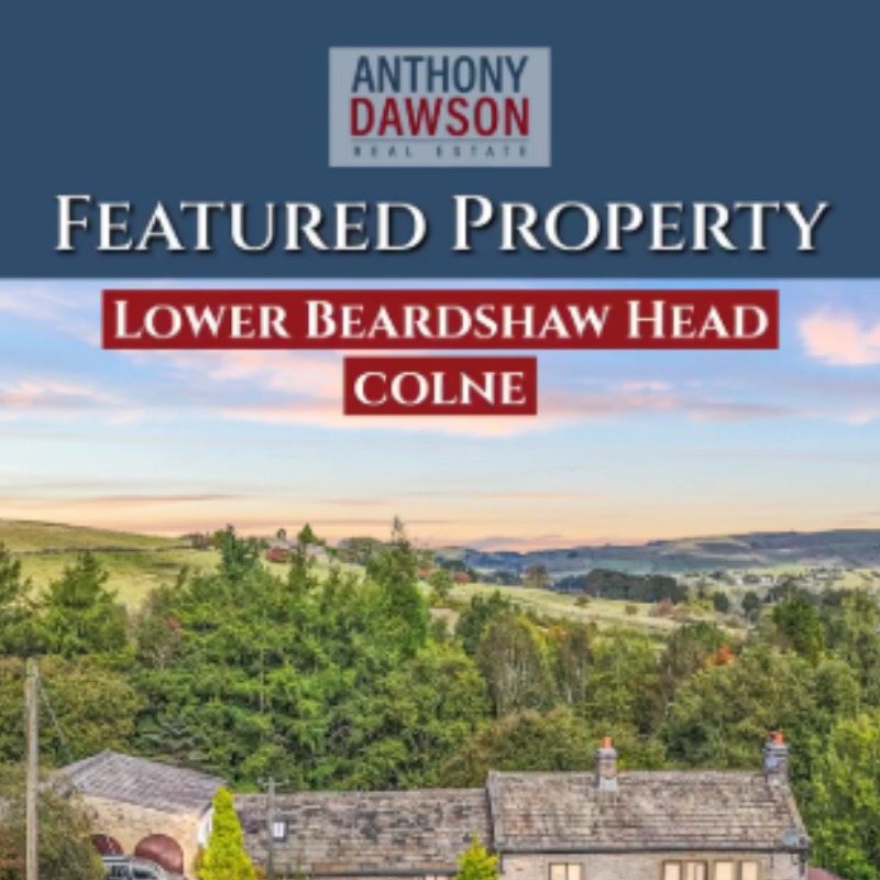
Creating campaigns designed to put individual properties in front of the right audience
From open house flyers and property brochures to social media graphics and paid advertising, I created marketing materials that showcase each property’s unique features and reaches the right audience.
Your 51 Keighley Road Open House flyer is a particularly strong portfolio piece because it combines property photography, typography, pricing, event information and supporting imagery in one complete campaign asset.
I would make that flyer quite prominent.
Then beside or underneath it show 2–3 social/video thumbnails from the same type of campaign.
That makes the portfolio tell the story:
PROPERTY → CAMPAIGN → SOCIAL → PRINT
rather than looking like a gallery of unrelated graphics.


SOCIAL & DIGITAL MARKETING
Building a strong online presennce.
Managing a multi-platform presence around properties, expertise and local market visibility
I created and managed content across:
Meta · TikTok · YouTube · LinkedIn · Google Business Profile
This included property videos, reels, graphics, market updates and paid campaigns.
For this section, I would strongly favour video thumbnails over static posts.
Perhaps:
PHONE MOCKUP
Instagram/Reel property video
then underneath:
3 smaller tiles: TikTok / YouTube / LinkedIn or property graphics.
This will demonstrate that you weren’t simply resizing one Canva graphic for five platforms.
CUSTOMER EXPERIENCE
Clear communication throughout the journey.
I designed a ‘What to Expect next’ guide to help clients understand the property marketing process, from preparation and photography through to open houses, viewings and ongoing support.
You created communications that supported the entire seller and buyer journey.
For example, your What to Expect Next document takes clients through preparation, photography, going live, promotion, open houses, viewings and ongoing follow-up — turning the brand into a much more professional customer experience.
I would show it like this:
WHAT TO EXPECT NEXT
Large document mockup
Small caption:
Customer Journey Communication
Branded client communication designed to explain the property marketing process and create a professional, consistent experience from instruction through to sale.
That is a really good piece of work to include.
EMAIL MARKETING
Keeping the brand visible between property transactions.
I designed monthly newsletters featuring property listings, open-house promotion,s local information and calls to action – helping to maintain engagement with the database and promote the brand year-round
The May newsletter is a particularly good example because it combines featured properties with community information and multiple conversion opportunities while maintaining the established visual identity.
Here I would show the newsletter long-form on a laptop or browser mockup, with perhaps one enlarged crop beside it.
PRINT & BRAND TOUCHPOINTS
Consistency beyond the screen
Icreated a range of printed materials to support the brand, including business cards, etterheads, open house signs and direct mailers.
Business Cards
Letterheads
Open House Flags
Direct Mail Flyers
Email Signatures
Sign Boards
Property Collateral
Your letterhead is useful here because even something as basic as stationery carries the same blue/red/landscape visual language used elsewhere.
I would lay these almost like objects on a white studio surface rather than individually stacking each piece.
ONGOING MARKETING & SUPPORT
Although I no longer manage Anthony Dawson Real Estate on a monthly basis, the relationship has continued on a project basis, with Anthony regularly returning to Bridge Group Digital for additional design and marketing collateral.
PLAN > CREATE > MANAGE > OPTIMISE >